


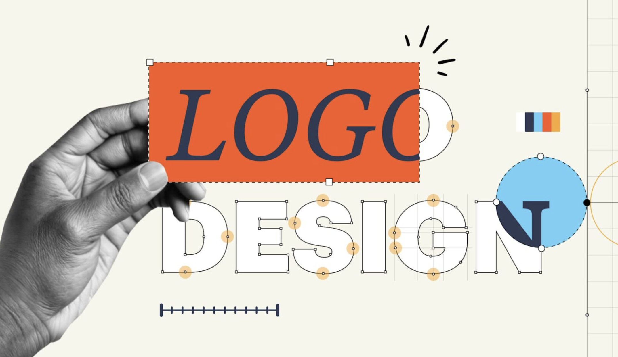
What Your Logo Says About Your Business Before Anyone Reads a Word
By Cara Goodman, Owner of CEB Design Studio
You’ve got about three seconds.
That’s roughly how long it takes a potential customer to form a first impression of your business — and most of that judgment happens before they read your name, your tagline, or anything else you’ve carefully written. It happens the moment they see your logo. We don’t often think about it that way. Most business owners think of a logo as a formality — something you need before you can print business cards or launch a website. But the truth is, your logo is doing active work every single day, either building trust or quietly eroding it.
The silent conversation your logo is already Having
When someone sees your logo for the first time, their brain immediately starts answering questions they didn’t consciously ask: Is this business legitimate? Is it worth my time? Does it feel like “my kind of place”? A polished, well-crafted logo signals that you take your business seriously — and by extension, that you’ll take your customers seriously. It communicates stability, professionalism, and attention to detail before a single word is exchanged. A dated, cluttered, or inconsistent logo sends the opposite message. It doesn’t matter how good your product is or how excellent your service is. If the first visual impression doesn’t hold up, many customers won’t stick around long enough to find out. This isn’t shallow — it’s human psychology. We are wired to use visual cues as shortcuts for trust.
What “bad” actually looks like
Bad logos rarely look obviously terrible. More often, they just look forgettable — or worse, they look like a business that’s trying to save money in the wrong places.
Here are the most common problems local businesses run into:
- Too much going on. A logo that tries to show everything — the product, the location, the founder’s name, three different fonts — ends up communicating nothing clearly. Simplicity isn’t laziness. It’s discipline.
- Clip art and stock icons. If your competitor in the next town over uses the same wrench graphic or coffee cup silhouette, your logo isn’t doing any work to differentiate you. Generic imagery is forgettable by design.
- Fonts that don’t match the brand. A family law firm using a bubbly script font. A children’s boutique using a heavy industrial typeface. Fonts carry mood and meaning — a mismatch creates subconscious friction that customers can’t always name, but they feel it.
- Poor scalability. A logo that looks fine on a website banner but turns into an unreadable blob on a business card — or worse, on a vehicle wrap or storefront sign — is a logo that wasn’t designed for real-world use.
What the right logo actually does for you
A professionally designed logo works harder than most business owners realize.
- It creates instant recognition. Think about the businesses in our community that have been around for decades. Part of what makes them feel like institutions is that you’ve seen their mark over and over, in consistent contexts. That familiarity is built, not accidental.
- It gives you visual consistency across every touchpoint — your website, your social profiles, your signage, your packaging, your invoices. When all of those things look cohesive, customers feel like they’re dealing with an organized, trustworthy operation. When they don’t match, something feels off even if the customer can’t articulate why.
- It attracts the right customers. Design speaks to specific audiences. A rustic, hand-lettered mark draws a different crowd than a clean, modern geometric mark — even if both businesses offer similar services. The right logo acts as a filter, attracting the people most likely to connect with what you offer.
- And it holds its value over time. A well-designed logo doesn’t need to be replaced every few years. Done right, it grows more recognizable and more trusted the longer it’s in use.
When it’s time to take a hard look
If any of these sound familiar, it may be worth a conversation about your visual identity:
• Your logo was made by a friend as a favor, or put together quickly using a free online tool
• You’ve rebranded your services or your target market has shifted, but your logo hasn’t changed with it
• You feel embarrassed handing out business cards or hesitant to put your logo on a vehicle or storefront
• Customers sometimes confuse you with a competitor
• Your logo looks different across your website, social media, and printed materials
None of these mean your business is failing. They just mean your visual identity hasn’t caught up with where your business actually is — and where it’s trying to go.
Design is an investment, not an expense
Here on Florida’s Forgotten Coast, local businesses are the backbone of this community. The ones that grow and endure aren’t always the ones with the biggest budgets — they’re the ones that understand the value of showing up professionally at every touchpoint. Your logo is the face of everything you do. It’s on your signage when someone drives past. It’s in their email inbox. It’s what their friend sees when they tag you in a post. It’s working for you — or against you — around the clock.
Getting it right isn’t vanity. It’s strategy.
CEB Design Studio is a graphic design firm serving businesses in the Florida area and beyond. We specialize in brand identity, marketing design, and web presence. If you’d like a free, no-pressure review of your current logo and branding, reach out at carab1203@ gmail.com.
Related Articles
Sean of the South: Enough
May 25, 2026
By Sean Dietrich What if I told you that you are enough? Moreover, what if you woke up this morning

Flora and Fauna of the Historic Gulf Cemetery
May 25, 2026
By Helen Petre South of 98, on 293, almost to the beach, is a cemetery on 40 acres of pristine

May Fishing Report on the Forgotten Coast
May 25, 2026
May is the month that reminds every angler on the Forgotten Coast exactly why they live here. The water temperatures